McDonald’s: Feel-Good Customer Journeys
What was the brief?
Cement the digital habit amongst McDonald’s most valuable customers. Establish the My McDonald’s app as their channel of choice, with an automated, multi-channel programme to build frequency and value. And be ready to optimise and adapt it rapidly in a COVID-disrupted market environment.
What was the strategy?
To inspire and incentivise customers to come back to the app again and again using early behaviour data signals to determine customer propensity to use the app. Then, overcome inertia and reinforce frequent use with an automated nudge programme running on Adobe Campaign, adapting in real time with customer response.
What was the campaign solution?
Get the customer closer to what they love in their inbox and on their lockscreen. Make it so simple, seamless and personalised that the next action is a no-brainer. Nudge them effortlessly along the journey using the unlocked potential of the Adobe Campaign platform to deliver hyper intelligent automation.
What were the results?
We've seen 7% more customers stay active after 6 months and a 10% increase in revenue per customer against control. With the programme largely automated and negligible ongoing marketing costs, ROI stands at 50:1 and growing.
Explore a live example below


Campaign in Detail
Strategy
The My McDonald’s app enables customers to order remotely for restaurant, Drive-thru and McDelivery. It has the data potential to create highly personalised, 1-2-1 relationships. But many customers who registered on the app were ordering only once, or not all. As we went into lockdown, accelerating adoption of the app was a top priority.
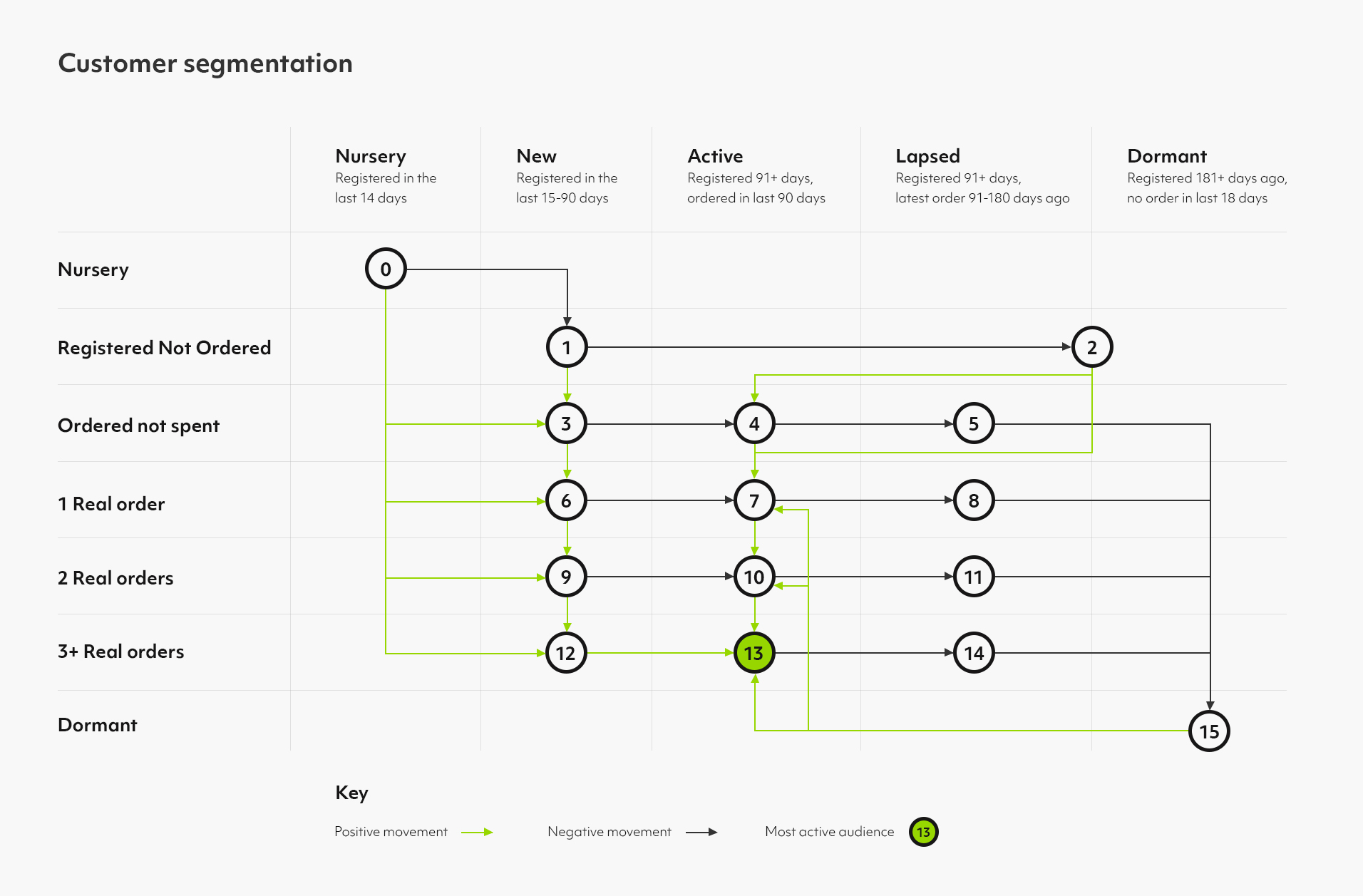
First we unlocked data insight. We developed an RFV segmentation that placed customers into segments, depending on recency, frequency, spend and behaviours such as use of offers. These segments ranged from newly registered customers to established, high-frequency users. By analysing customer movement between segments over time, we were able to quantify the revenue potential of increasing retention.
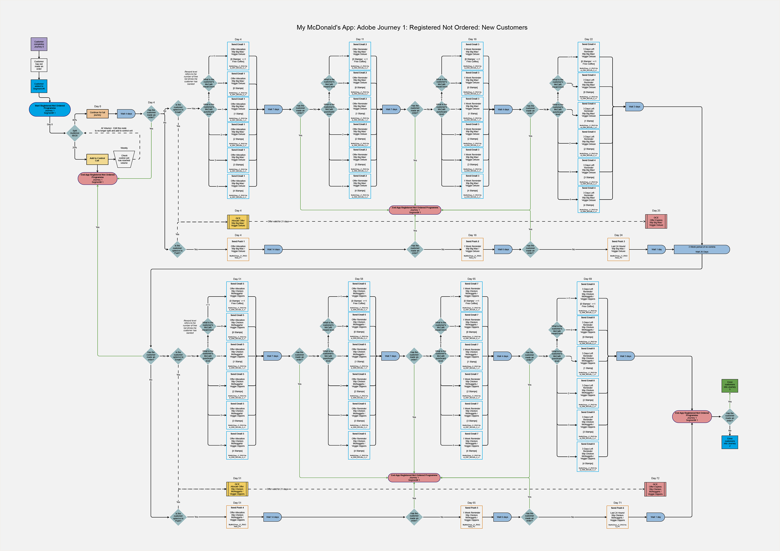
Then came journey mapping. Multiple journeys were identified, each mapped out in detail with a specific insight-driven content strategy playing out across both email and push channels.
- New customers received a nursery journey, getting them comfortable with the app and all of its benefits to maximise repeat ordering without having to incentivise.
- Frequent customers were nudged with cross-sell offers to get them using the app in different day-parts, growing frequency and value further.
- Lapsing customers were targeted based on lifetime value. Richer reactivation offers were reserved for our more valuable customers whilst content to those smaller spenders focused on addressing usage barriers.
 Zoom in
Each journey runs automatically for up to 85 days. Customers move automatically to the next segment for them based on their behavioural response. Smart, real-time, and responsive.
Solution
The creative job was to get the customer closer to what they love, simply and on brand. To make the next action a no-brainer. To nudge along the journey in the right direction.
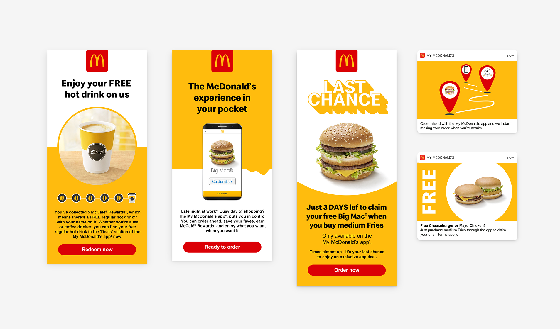
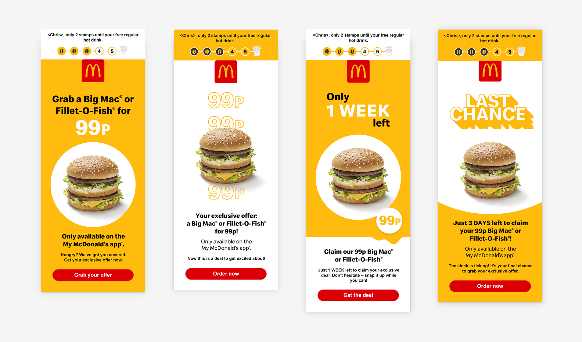
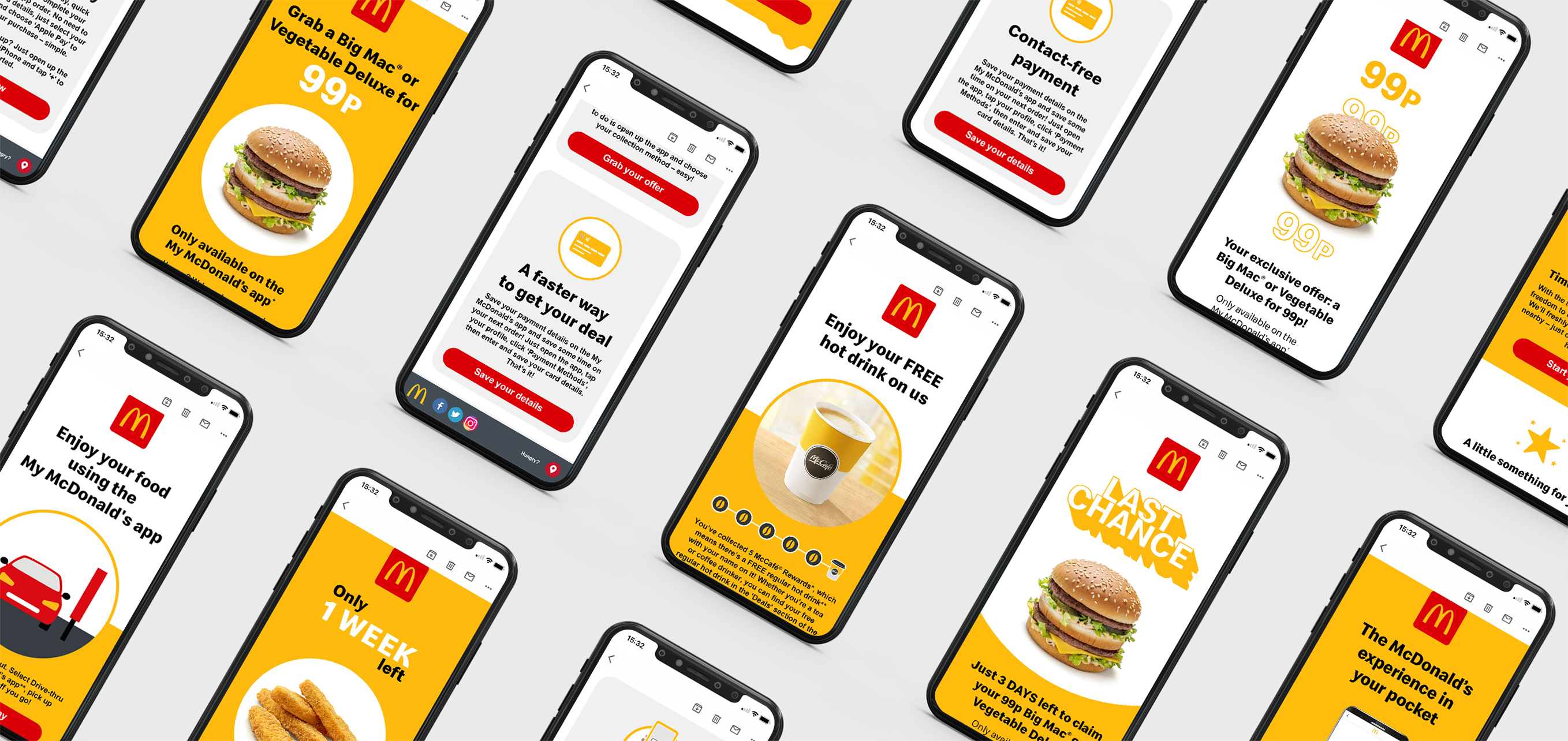
First up, we created a system of striking visual elements and language using the McDonald’s brand to really bring the benefits of using the app to life. Insights into the McDonald’s audience show us animation and interactivity increase engagement in terms of both click-throughs and, importantly, conversions.
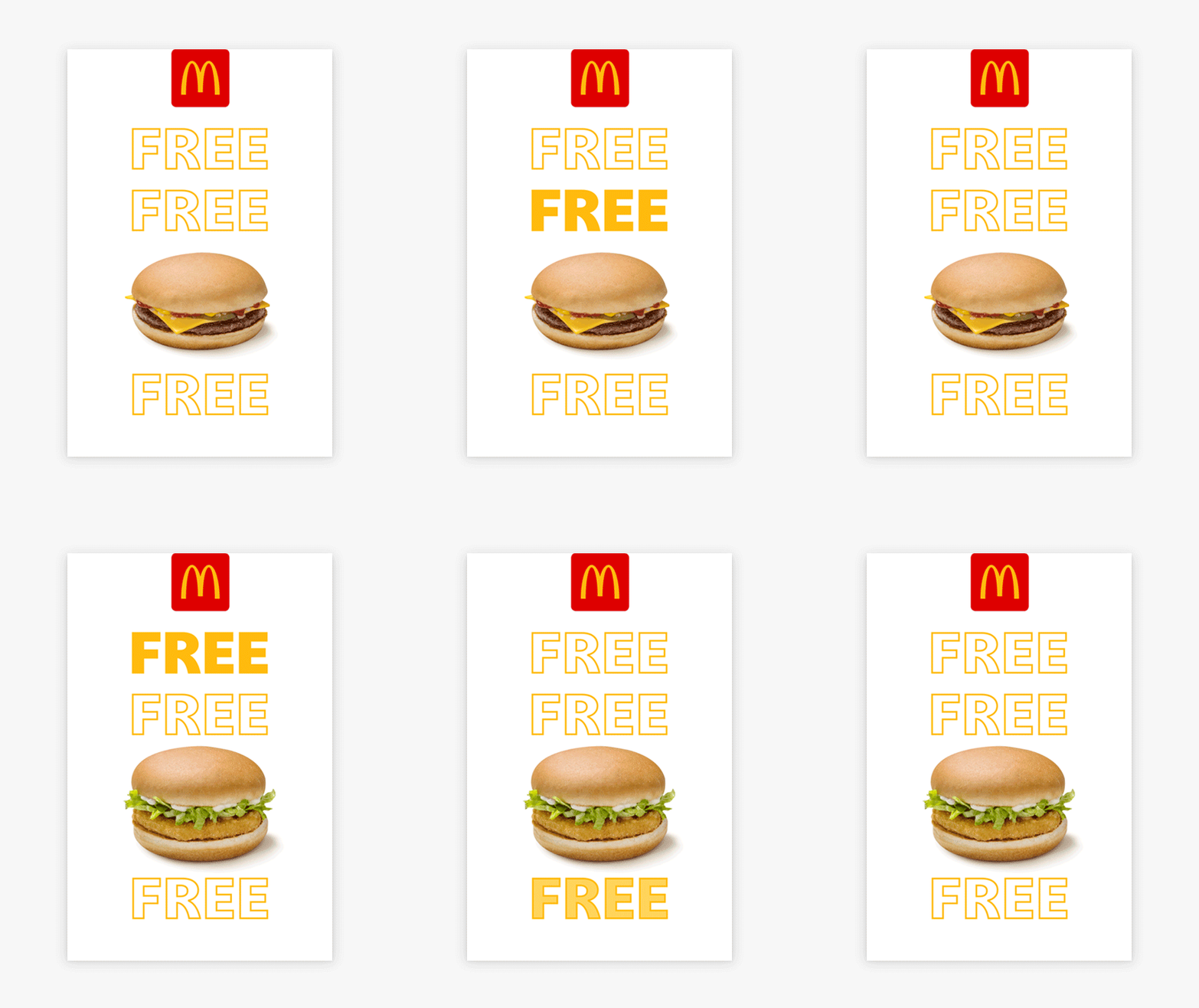
Email headers used animation to either highlight app benefits or promote cross-sell offers.
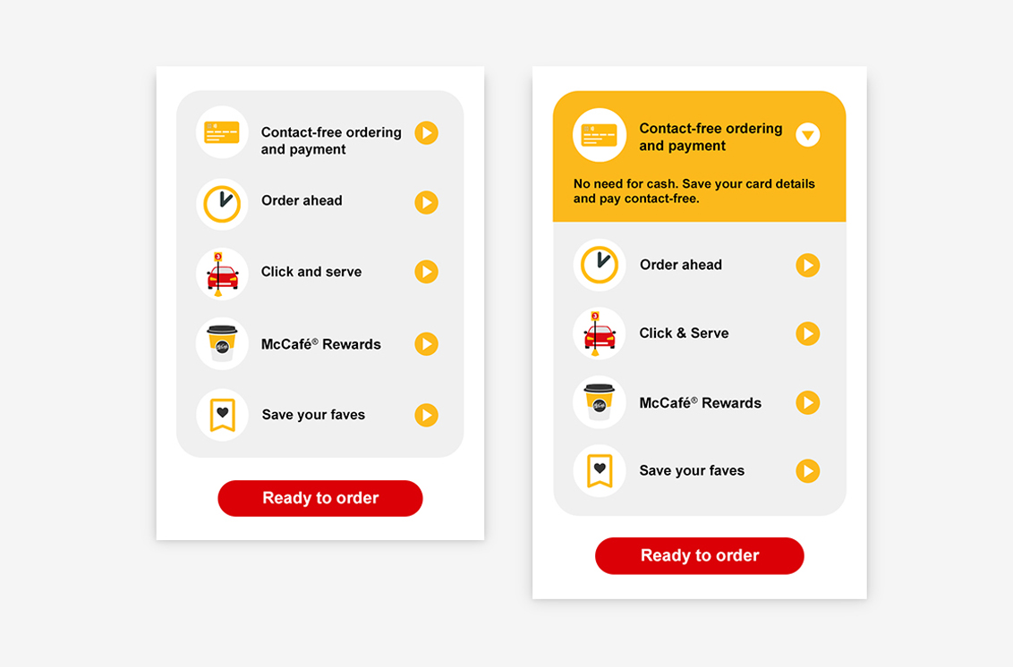
Interactivity allowed customers to skim content for top line benefits or dig deeper for more information. Using our proprietary tracking pixels, we could see which information piqued interest and optimise future content.
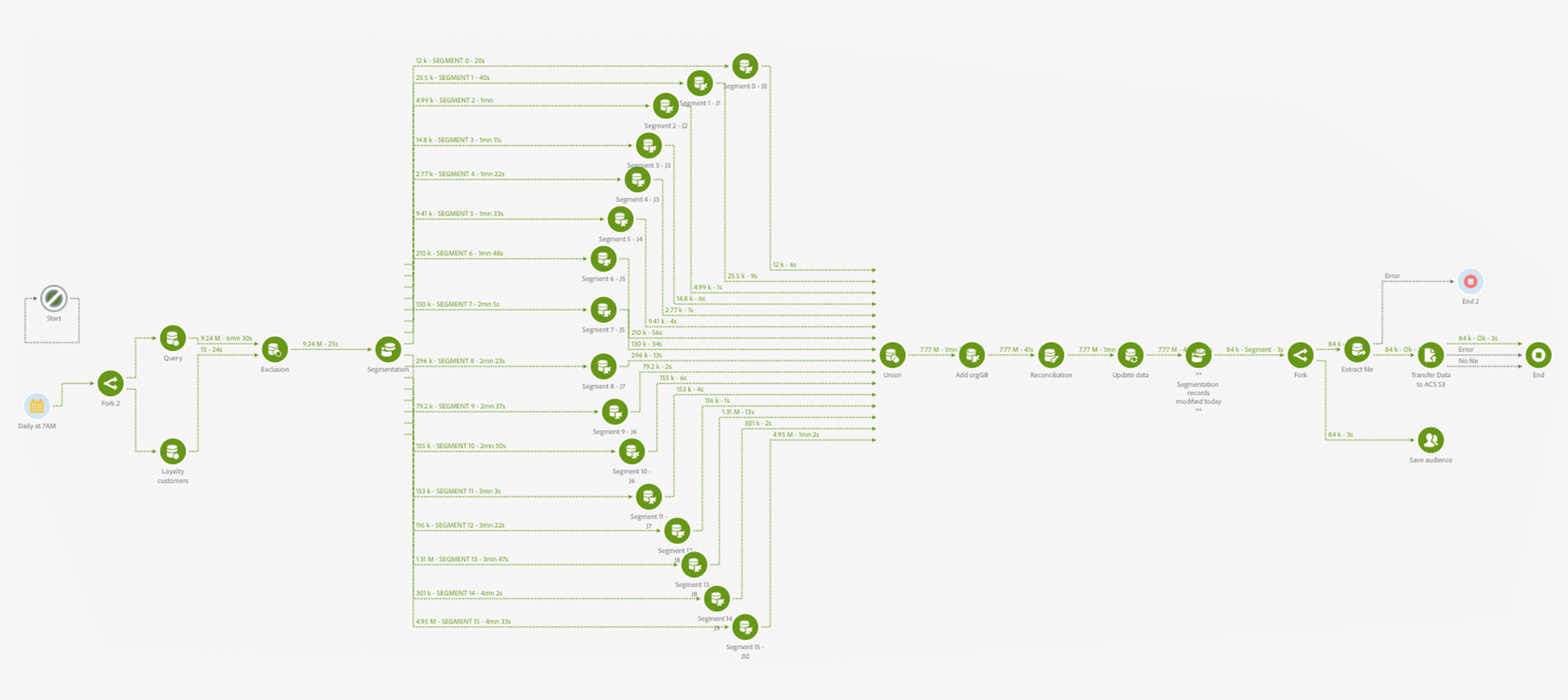
The communications may have looked simple to the customer but it was driven by a complex engine. And the creativity involved in designing that was no mean feat as it meant customising the Adobe platform with a bespoke workflow and custom API to enable a rolling 24-hour customer segment migration and measurement of incremental behaviour against control that the success of the programme was built upon.
An intelligently simple, yet compelling campaign that took customers on their own feel-good journey.

